
01
Complementary colors
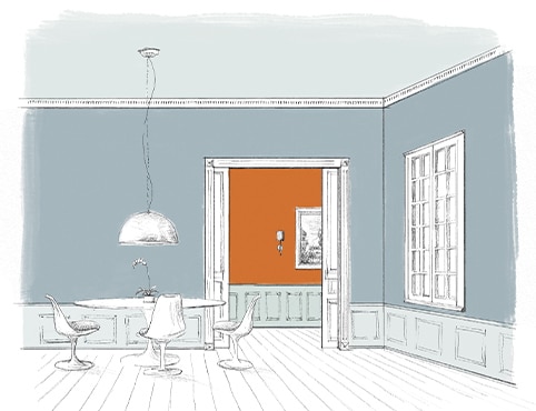
Pair opposites on the color wheel for clear contrast and energy. Let one hue lead while its complement appears in a smaller, deliberate dose.
Compare the colors in your own lightColor insights
Practical ways to understand relationships, undertones, light and flow before your paint is mixed.
Pair opposites on the color wheel for clear contrast and energy. Let one hue lead while its complement appears in a smaller, deliberate dose.
Compare the colors in your own light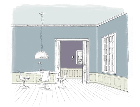
Neighboring hues share a natural relationship. Choose one dominant color, then move warmer or cooler for supporting rooms and architectural details.
Compare the colors in your own light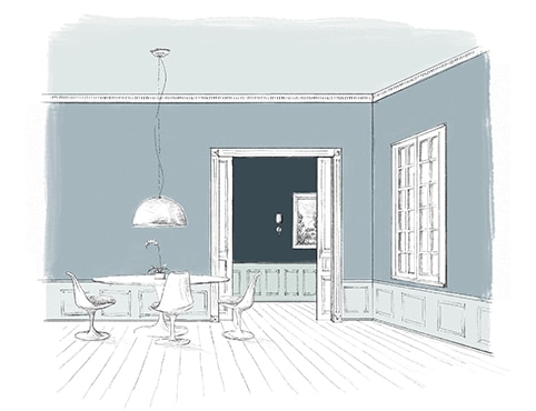
Build depth with lighter and darker values of one hue. Differences in sheen can add another quiet layer without disrupting the palette.
Compare the colors in your own light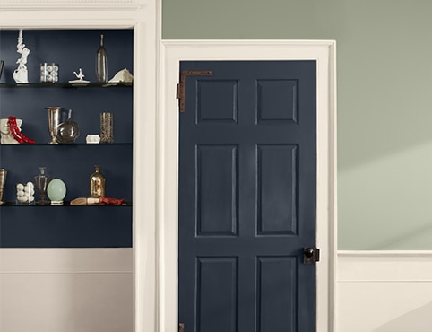
Soft sage, sunbaked clay and mineral blue can behave like neutrals when their undertones connect to flooring, stone and textiles.
Compare the colors in your own light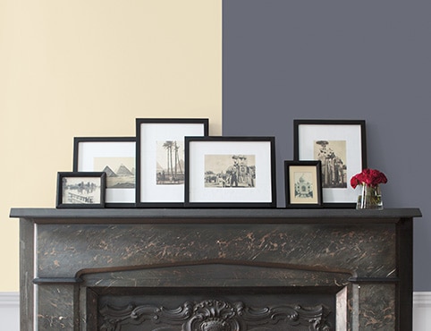
Warm color advances and feels enveloping; cool color often recedes and feels open. Balance temperature with the direction and strength of the room’s light.
Compare the colors in your own light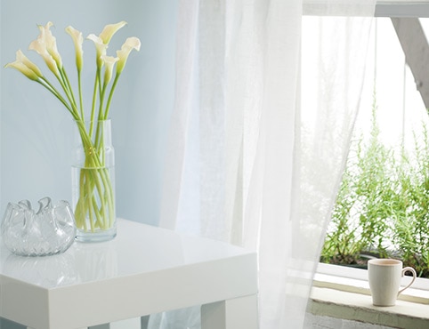
Start with what cannot change—wood, tile, stone and upholstery—then collect colors that repeat or intentionally contrast their undertones.
Compare the colors in your own lightReady to explore?
Browse a curated collection, save the colors that respond to your space, and compare physical chips at Global Paint.
Browse color collections