
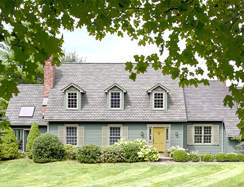
A whole-house palette is not a row of unrelated swatches. It is a hierarchy: the largest field color establishes the mood, trim clarifies the architecture, and one or two accents guide the eye. Roofing, masonry and paving act as additional colors even when they are not being painted.
Begin with what will not change
Photograph the roof, brick, stone, metalwork and paving in neutral daylight. Identify whether those materials lean warm, cool or balanced, then choose a body-color family that connects rather than competes.
Large exterior surfaces usually make color appear lighter and more vivid than a small chip, so review generous samples on more than one elevation.
Assign every color a role
Keep the main body quiet enough to unify the house. Use trim to outline windows, cornices and porch structure, or bring body and trim closer together for a softer contemporary reading.
- Body color: the dominant field
- Trim color: edges and architectural rhythm
- Accent color: door, shutters or select details
- Foundation color: a grounded transition to the site
Map the application sequence
Inspect each substrate separately. Wood, stucco, masonry, metal and previously coated vinyl may need different preparation and primer. Complete repairs and upper elevations first, then work through trim and accents so the finished edges remain clean.