
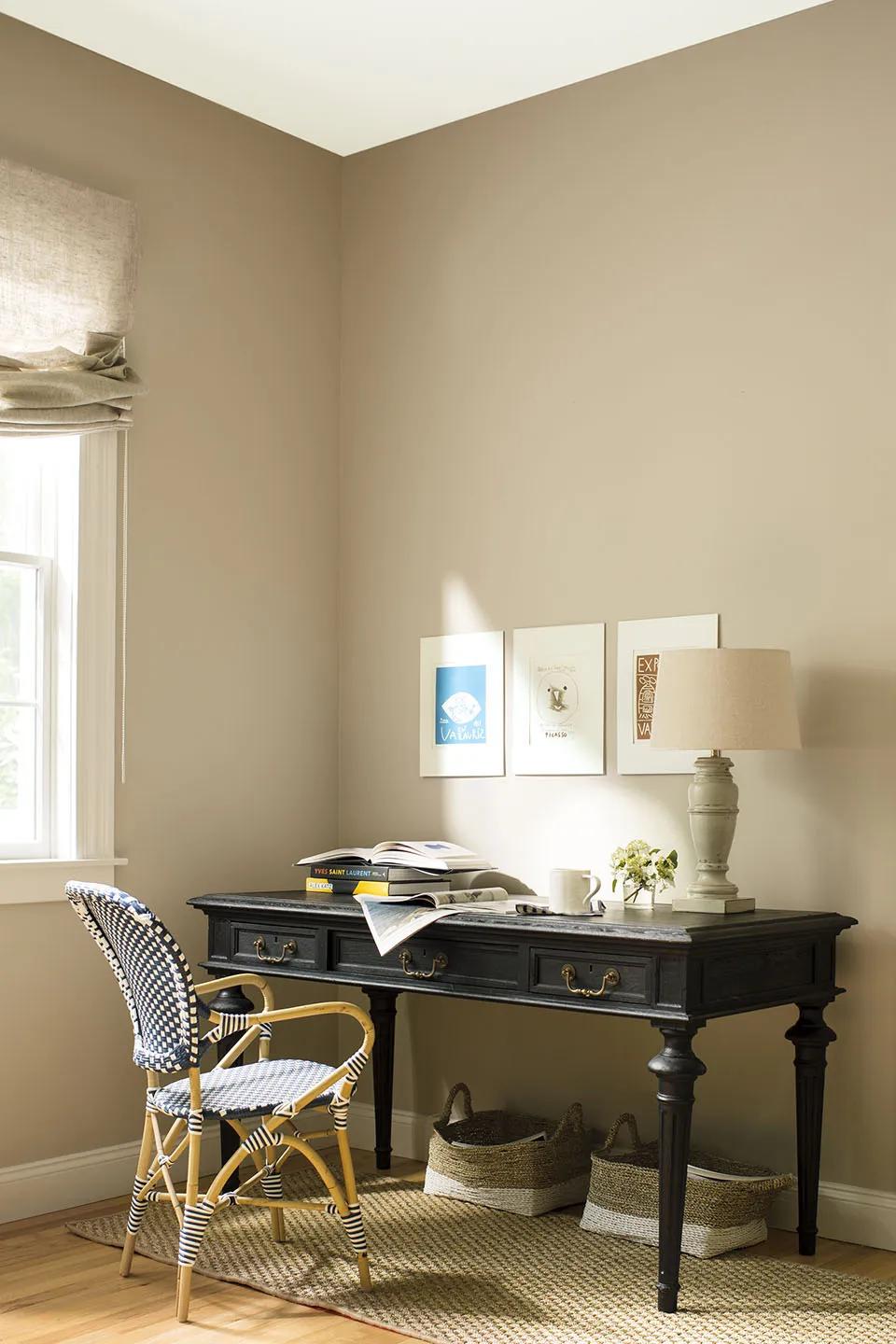
Benjamin Moore’s Historical Color Collection began in 1976 with hues inspired by 18th- and 19th-century North American architecture. Fifty years later, its 191 colors remain useful because they are nuanced enough to work across periods, materials, and changing daylight.
Built from architecture, not a passing trend
The collection moves from warm plaster-like neutrals through botanical greens, maritime blues, golds and deeply grounded reds. That range lets an older Brooklyn home retain its character, but it works just as well when a newer apartment needs warmth and visual history.
The strength of these colors is restraint. Even the deepest shades have complex undertones that connect naturally to wood, stone, metal and aged finishes.
A simple way to use the collection
Begin with the room’s fixed materials. Choose a quieter Historical neutral for the largest surface, then use a deeper HC color on cabinetry, a front door, built-ins or a smaller room. Keep trim consistent when you want separate rooms to feel connected.
- Hale Navy HC-154: a softened, architectural navy
- Revere Pewter HC-172: a bridge between warm and cool
- Kendall Charcoal HC-166: dependable depth for millwork
- Essex Green HC-188: a near-black green with presence
Test before you commit
An HC number tells you the collection, not how a color will behave in your room. Review a large sample beside flooring and fabrics, then look at it in morning, afternoon and evening light before choosing the final sheen.