
A successful whole-home palette feels connected as you move from one room to the next, yet every space still has its own purpose and atmosphere. The goal is not to find one perfect neutral. It is to build a small, disciplined family of colors that responds to the home’s light, fixed materials, and architecture.
Begin with what is not changing
Flooring, stone, tile, countertops, large textiles, and stained wood already contain color. Place samples beside these materials before judging them against an empty white wall. Their warm, cool, red, yellow, green, or gray undertones establish the boundaries of a palette that will feel intentional.
In a home with several fixed finishes, look for the undertone they share rather than trying to match every material. That common note becomes the thread linking rooms together.
Give every color a role
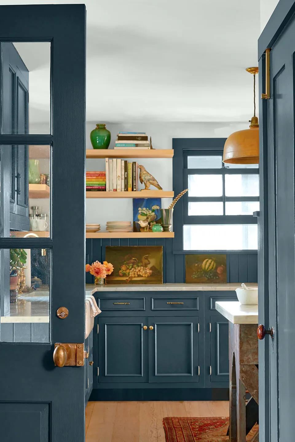
Organize the palette into a light foundation, one or two midtones, a deeper anchor, and an optional accent. The lightest color can carry halls and connecting spaces. Midtones bring identity to bedrooms, kitchens, or living rooms. The deepest shade gives millwork, a dining room, an entry, or a small powder room architectural weight.
- Foundation: halls, open areas, and visual transitions
- Midtone: rooms that need presence without heaviness
- Anchor: cabinetry, built-ins, doors, or a focused room
- Accent: a sparing note repeated in art, textiles, or painted furniture
Create rhythm through repetition
Repeat at least one color or painted element within sight lines. A consistent trim color is the simplest method, but repetition can also come from the same cabinet color appearing on an island, a door, or a distant built-in. This creates rhythm while allowing wall colors to change.
Use transitions deliberately. Where two rooms meet without a door, colors with similar depth or related undertones usually flow more quietly. A framed doorway can support a stronger contrast because the architecture provides a visual stop.
Test the palette as a group
Review large samples together in every important exposure: cool morning rooms, warm afternoon rooms, dim corridors, and artificial evening light. A color that looks balanced in one room may become too cold, too yellow, or too pale in another.
Label each sample with its intended room and finish. Then live with the group for several days. Editing one weak color is much easier before the project begins than after adjacent rooms have already been painted.